A feature is similar to a panel and includes an image. This chunk may be used for spotlighting content such as student profiles. Reference the Web Style Guide for more information about features.
Feature chunk
This is an example of a feature header.
This is a subhead.
This is the text area for a feature.
This is an example of a link labelFeature fields
Header
The header is a text-only field that displays in the largest size text. This field is text-only.
Subhead
The subhead is a text-only field in a smaller font size. A feature may have multiple subheads. For example, for a student spotlight, two subheads may be the student’s two majors.
Content
Text of the feature is included here.
Image
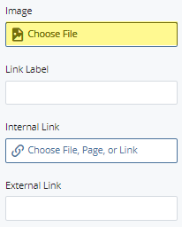
The image field associates an image with the feature. Upload the image to WCMS prior to adding the image. For guidelines on image sizes, visit the Web Style Guide.
Link Label
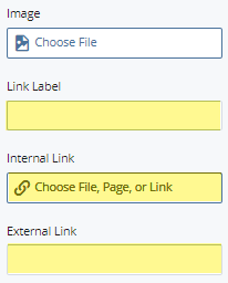
This is a text-only field that displays as a button at the end of a feature. The user can click it to learn more about a topic.
Link
Either an internal link or external link may be added to the button. For an internal link (within the website), navigate using the folder structure in the WCMS. For an external link, add the URL.
Creating a feature chunk
Step 1
Expand to Section > Chunk. Select the Feature chunk type.
Step 2
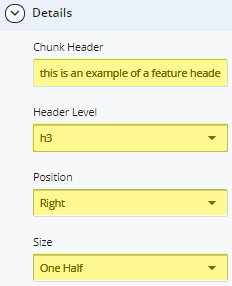
Expand to Section > Chunk > Details. Enter the Chunk Header, Header Level, Position, and Size.
Step 3
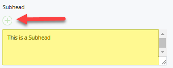
For a Subhead, enter in the Subhead field. For an additional subhead, click the green [+] button.
Step 4
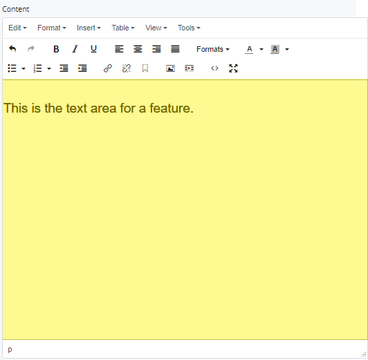
Enter text for the feature in the Content field.
The Content field will only accept the following HTML elements:
- Links:
Indiana University
- Bold text:
Indiana University
- Italicized text:
Indiana University
- Span tags
<span></span>
All other HTML elements will be stripped out.
Step 5
To add an Image, select an uploaded image.
Step 6
To add a link to the feature, type text for a Link Label. Then add an Internal or External link.
Step 7
To save a draft, click Save & Preview. Submit the draft to apply your changes. Publish the page.
Creating a carousel of features
Follow the steps below to create three or more feature chunks in a row that turn into sliding elements on smaller devices. The suggested image size for a group of three features is 768px x 512px.
Step 1
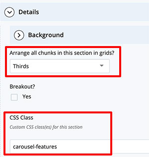
Create a new section and select Thirds under Arrange all chunks in this section in grids? in the Section Details.
Step 2
In the CSS Class field, enter carousel-features
.
Step 3
Under Chunk, use the + to add three or more chunks to the section.
Step 4
Add content to each feature.
Step 5
Submit and Publish.
Carousel example
Feature header
This is the first feature in a carousel.
Feature header 2
This is the second feature.
Feature header 3
This is the third feature in the series.