Images can be used single images, image essays or slideshows. Refer to the following guidelines to maintain certain standards and consistency in images on your website.
Aspect Ratio
Aspect ratio is the relationship between the image's width and height. When cropping your photos, consider the context of the photo, the composition of the layout, and how well photos balance visually with the surrounding chunks.
We recommend picking one of the following image aspect ratios:


Image Dimensions
| Aspect ratio | One-third & one-half size | Two-thirds & full size |
|---|---|---|
| 1:1 | 768 px x 768 px | Don't use |
| 3:2 | 768 px x 512 px | Don't use |
| 4:3 | Don't use | 1024 px x 768 px |
| 2:1 | 768 px x 384 px | 1024 px x 512 px |
| Aspect ratio | Parallax size |
|---|---|
| 3:2 | 3072 px x 2048 px |
| Aspect ratio | Non-Parallax size |
|---|---|
| 3:1 | 1800 px x 600 px |
| Type | Desktop | Tablet | Mobile |
|---|---|---|---|
| Image Banner | 1800 px x 600 px (3:1 aspect ratio) | 1200 px x 400 px (3:1 aspect ratio) | 768 px x 512 px (3:2 aspect ratio) |
| Text Overlay | 1800 px x 600 px (3:1 aspect ratio) | 1200 px x 400 px (3:1 aspect ratio) | 768 px x 512 px (3:2 aspect ratio) |
| Text + Image (50/50) | 1024 px x 512 px (2:1 aspect ratio) | 512 px x 768 px (2:3 aspect ratio) | 768 px x 512 px (3:2 aspect ratio) |
| Video | 1800 px x 600 px (3:1 aspect ratio) | N/A | 768 px x 512 px (3:2 aspect ratio) |
Image File Format and Size
For the best performance possible, images should use the file format .webp.
To reduce page load time, which also benefits SEO, ensure all images are below 100 KB. This small file size is made more possible with .webp than other image file formats. You can also compress images using an online tool like Kraken. Kraken allows you to download your image in .webp format.
Naming Conventions
Naming images with intention can help you find the right image easily and also benefit your website's search engine optimization (SEO).
Some of the best practices to follow are:
- Use descriptive names to accurately describe the content of the image, but also be as brief as possible.
- Include keywords when appropriate, but avoid overusing/keyword stuffing.
- Use hyphens (-) instead of underscores (_) to separate words in the file name.
- Keep all letters lowercase.
- Avoid acronyms, abbreviations. If you are using an abbreviation, make sure it’s universally recognized.
- Any headshot should be firstname-lastname.
For portraits or feature images the following format is ideal. firstname-lastname-portrait-dimensions OR firstname-lastname-banner-dimensions OR firstname-lastname-photodescription-dimensions.
An ideal image file name might look like:
msm-haley-armstrong-volleyball-court-405x405.webp
Alt Text
Alternative text (alt text) describes the image for those using assistive technologies or people who have turned off the images in their browser. Enter alt text for every image, except profile images and decorative images that add nothing to the text. Instead of adding complementary information as a caption might, alt text should describe the photo itself. Learn more about alternative text for images.
Caption: A campus you have to see to believe
Alt text: People walking through Indiana University’s Sample Gates
How to prepare images for your website
Once you have your image cropped to the proper pixel dimensions and aspect ratio detailed above, you can follow these steps to compress and optimize your images.
Ideal file format: WEBP
Ideal file size: Below 100 KB
Step 1: Save image from Photoshop
- For CS5 & CS6 - Go to File > Save As.
For CC - Go to File > Export... > Save for Web (Legacy) - Make sure your file is properly named with no spaces, capitalization, or special characters. You may separate words with a hyphen, but don't use an underscore. Follow the guidelines in the Naming Conventions sections above.
- For format, select WEBP.

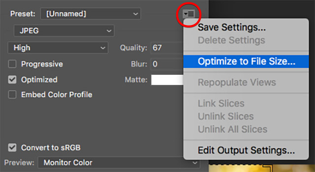
Step 2: Target File Size
- In the "Save for Web" dialog, use the "Optimize Menu" to input file size. Enter 100 KB in the "Desired file size".
- Use the "2-Up" viewer to preview the results.
Step 3: Optimize with Kraken.io
Kraken is a free online service that compresses images for the web.
- Go to Kraken.io.
- Upload your image for compression.
- Download the new compressed version.
Step 4: Upload to the WCMS
If you're working within our content management system:
- Go to the proper subfolder in the Images folder.
- Select Add Content > Default > File.
- Upload your file.
- Write the alt text for the image file. Select Edit > Metadata and enter the alt text in the Summary field. Learn how to write effective alt text in our accessibility guide.

